
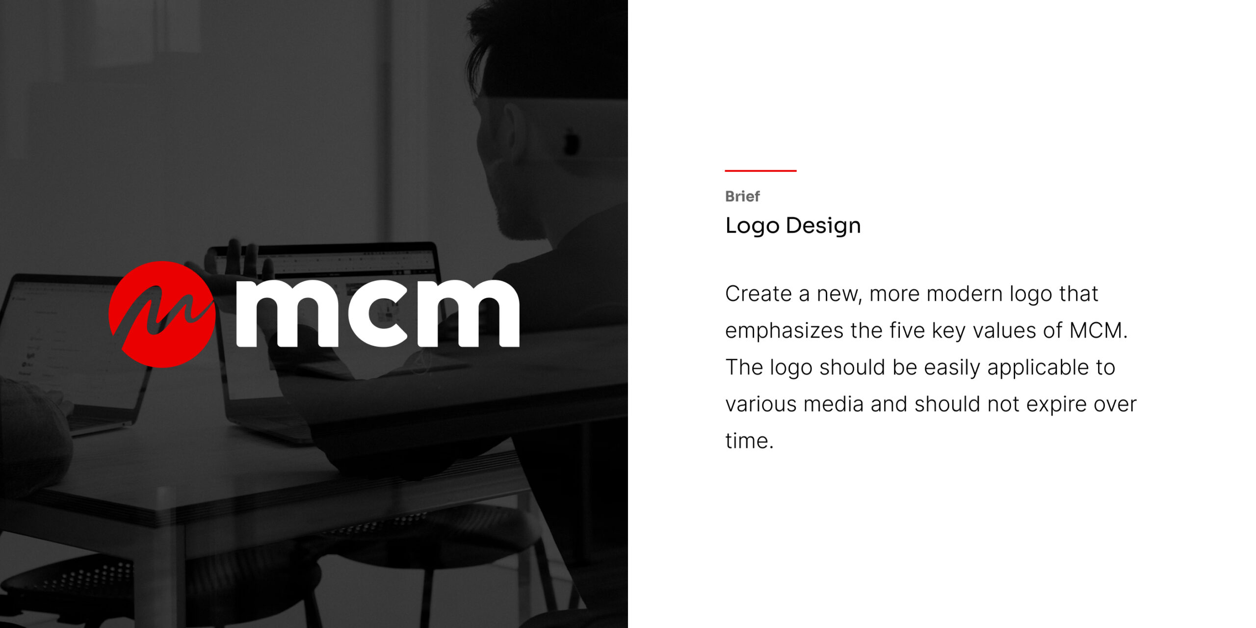
MCM (Merah Cipta Media) required a striking and cohesive brand identity that reflected its position as a dynamic force in the media landscape. The goal was to develop a versatile visual system anchored by a strong logo—one that could seamlessly scale from digital interfaces and business cards to large-scale environmental applications like billboards and vehicle wraps.
Merah Cipta Media
08-2023
Media / Communications
Logo Design, Brand Identity System, Corporate Collateral, Environmental Graphics

Media companies must communicate creativity, agility, and authority simultaneously. The challenge was to design an identity that:
It needed high visibility in saturated urban environments.
As a media entity, the brand needed to feel active and communicative rather than static.
The visual assets had to be legible and impactful across vastly different mediums (print, digital, 3D signage, and vehicle livery) and background contexts (light, dark, and brand-colored).
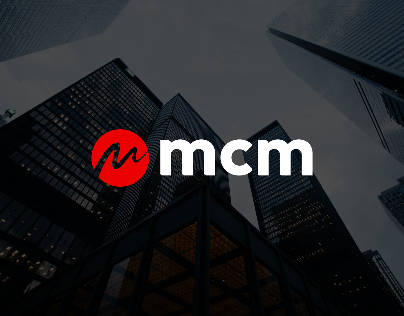
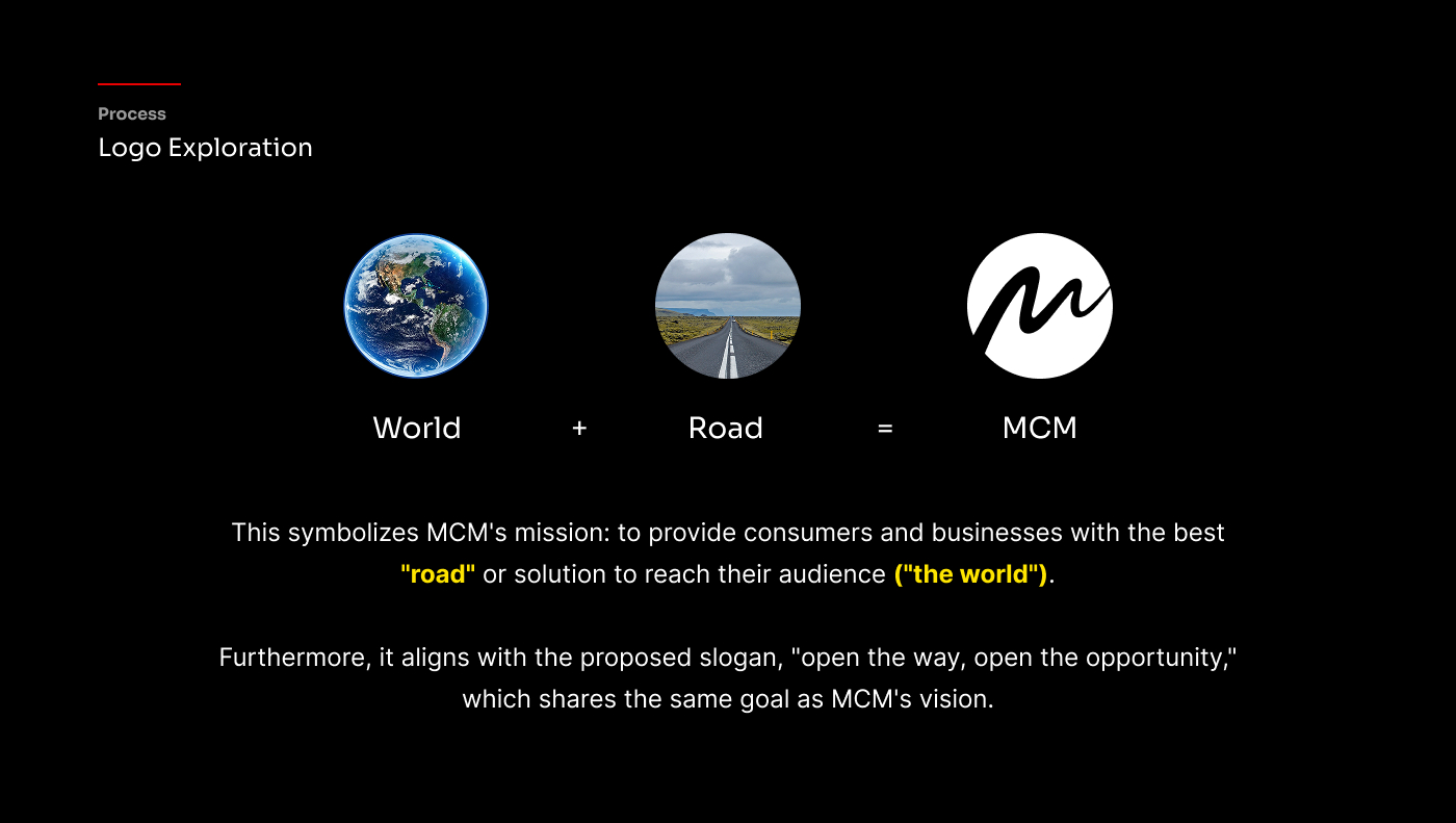
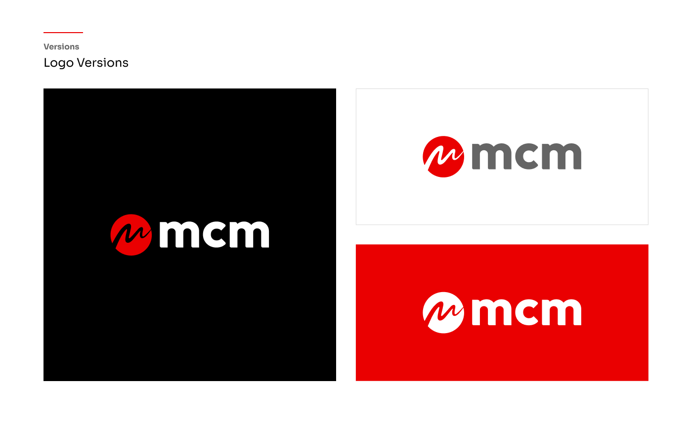
I designed the core logomark as a solid circular badge containing a fluid, continuous-line ‘M’. This interior line serves a dual purpose: it explicitly represents the brand’s initials while implicitly mimicking a media wave, a frequency, or a pulse. The circular container grounds the dynamic wave, giving the logo a stamp-like authority.
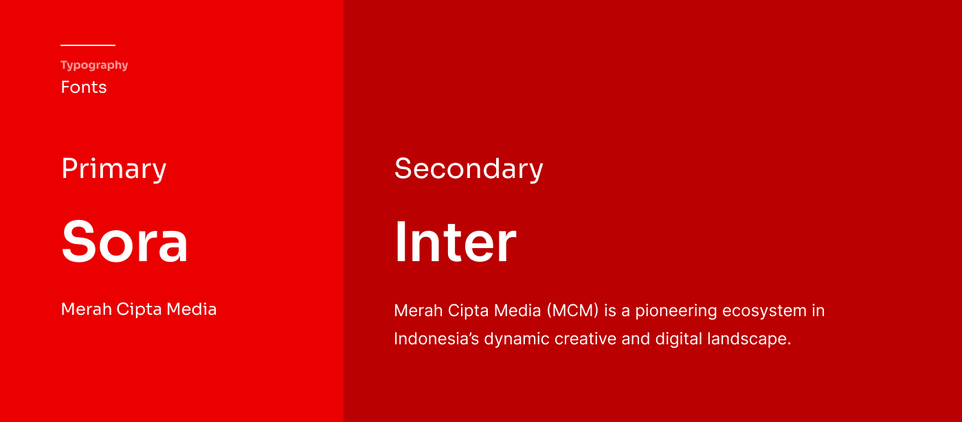
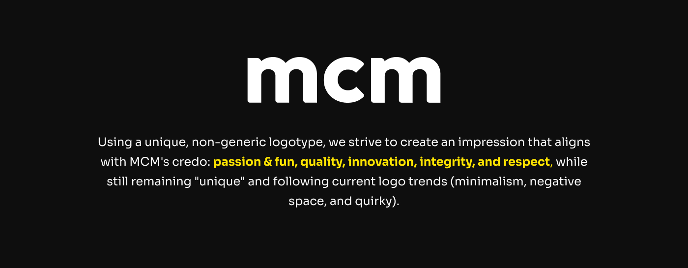
To balance the strong, aggressive visual weight of the logomark, I opted for a clean, custom lowercase sans-serif typography for the “mcm” wordmark. The rounded, geometric letterforms make the corporate entity feel modern, approachable, and forward-thinking.
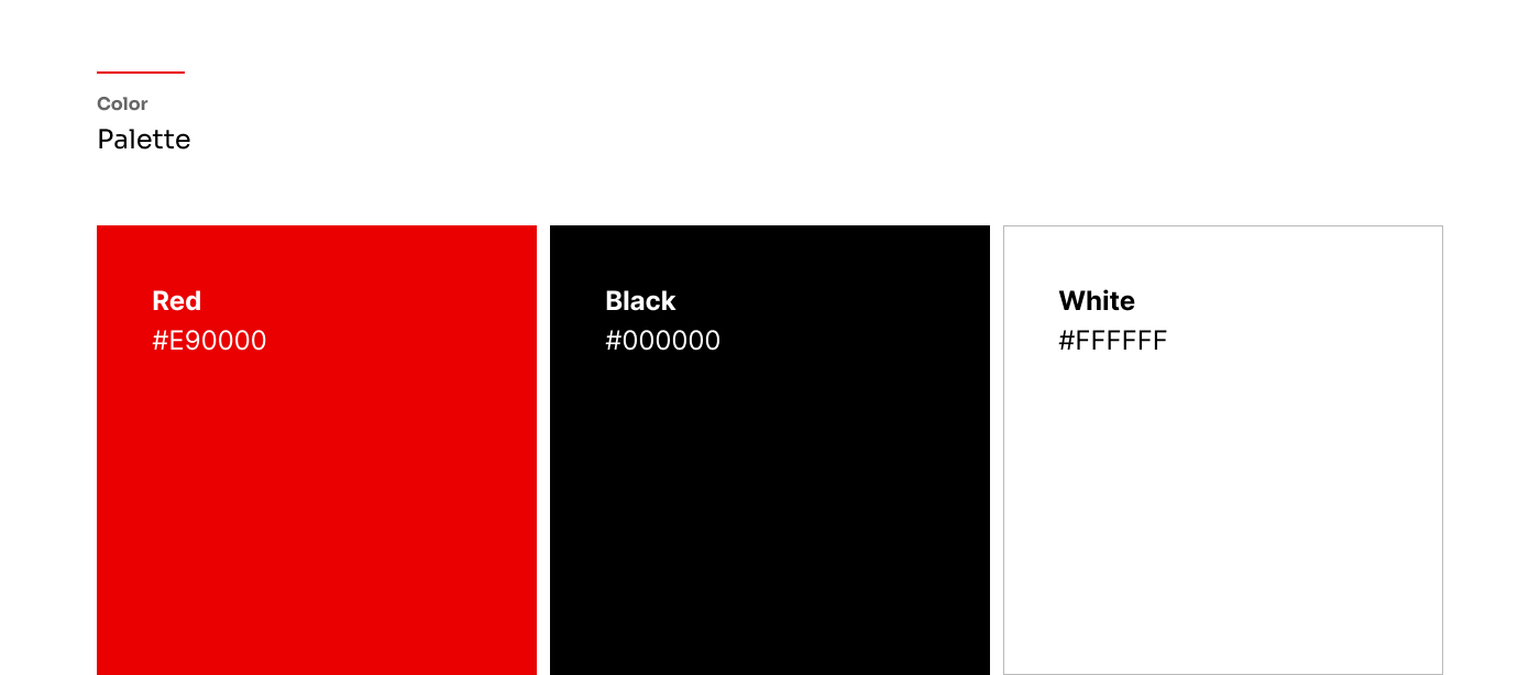
The brand name “Merah” translates to red, making the primary color choice an integral part of the company’s identity.
A vibrant, high-energy red acts as the focal point, commanding attention and signifying passion and action.
Used for high-contrast background applications, ensuring the red mark pops vividly whether applied to a dark corporate letterhead or a bright ID badge.
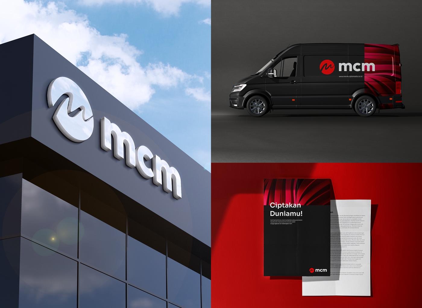
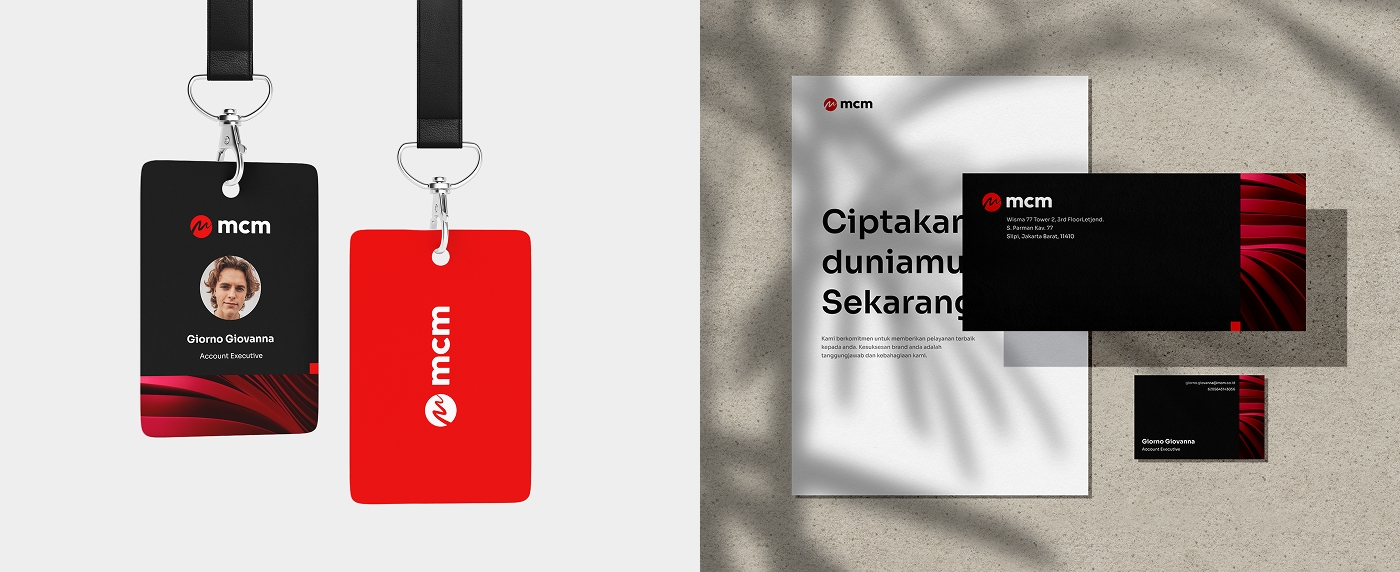
A logo only succeeds if it works within a broader ecosystem. I developed a secondary brand element—a flowing, 3D-rendered red ribbon texture—to add depth to the corporate collateral.
ID badges, business cards, and letterheads utilize stark, minimalist layouts paired with the flowing red texture, ensuring professionalism without sacrificing creative flair.
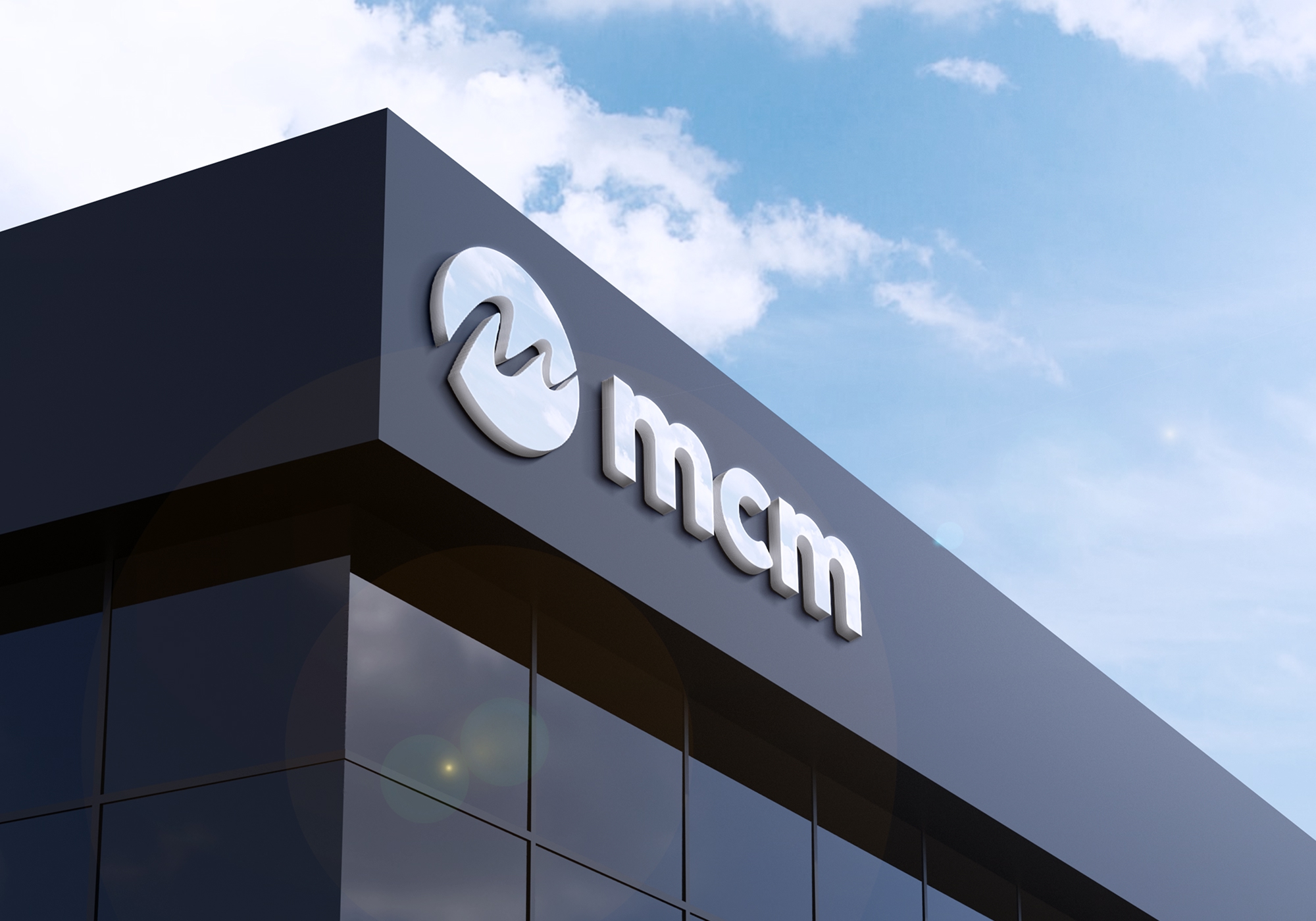
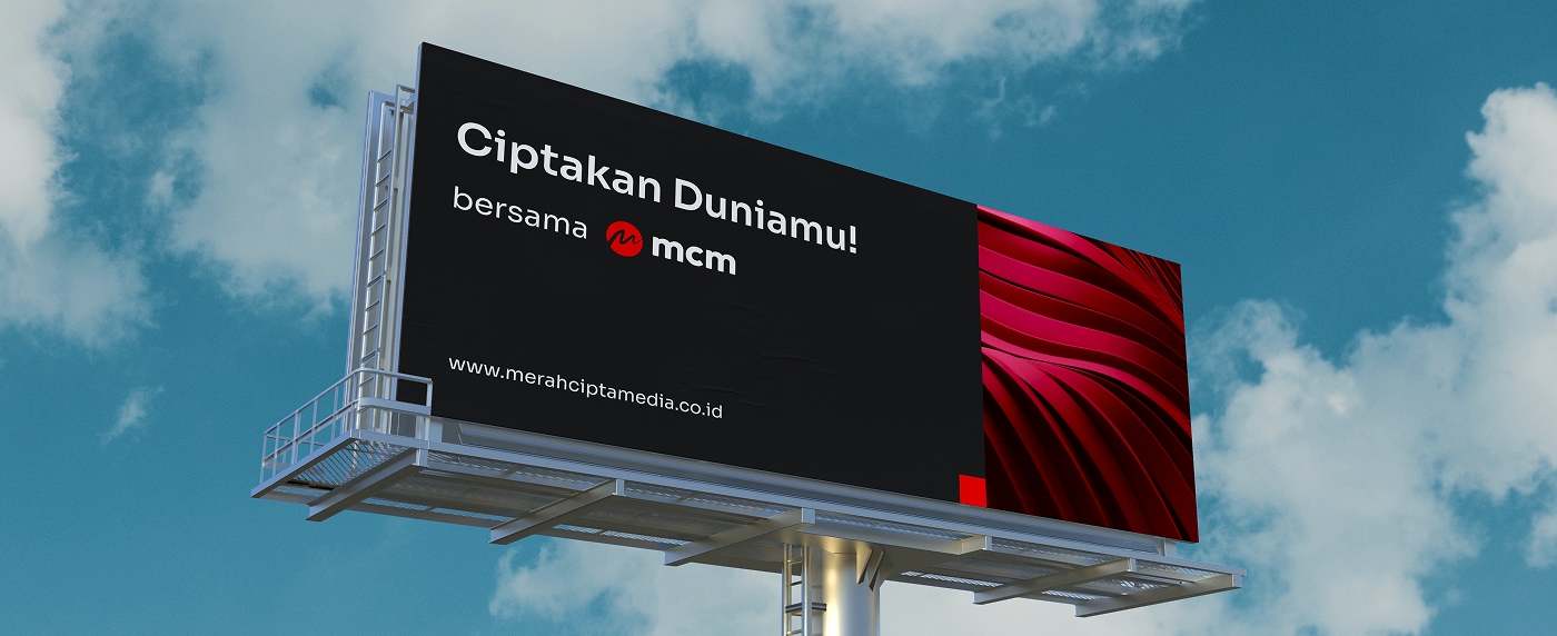
The logo’s scalability was tested and proven through large-format applications. The brand translates perfectly into 3D illuminated architectural signage, high-visibility billboard advertising featuring the campaign tagline "Ciptakan Duniamu!" (Create Your World!), and sleek, high-contrast fleet vehicle wraps.
The resulting identity equips MCM with a bold, uncompromising visual presence. By combining a highly scalable logomark with a strict, high-contrast color system and dynamic secondary textures, the brand is perfectly positioned to capture attention and communicate its creative authority across any medium.